Rethinking The Mobile Onboaring Flow


📱 iOS
🥳 User Experience
🧠 Product Design


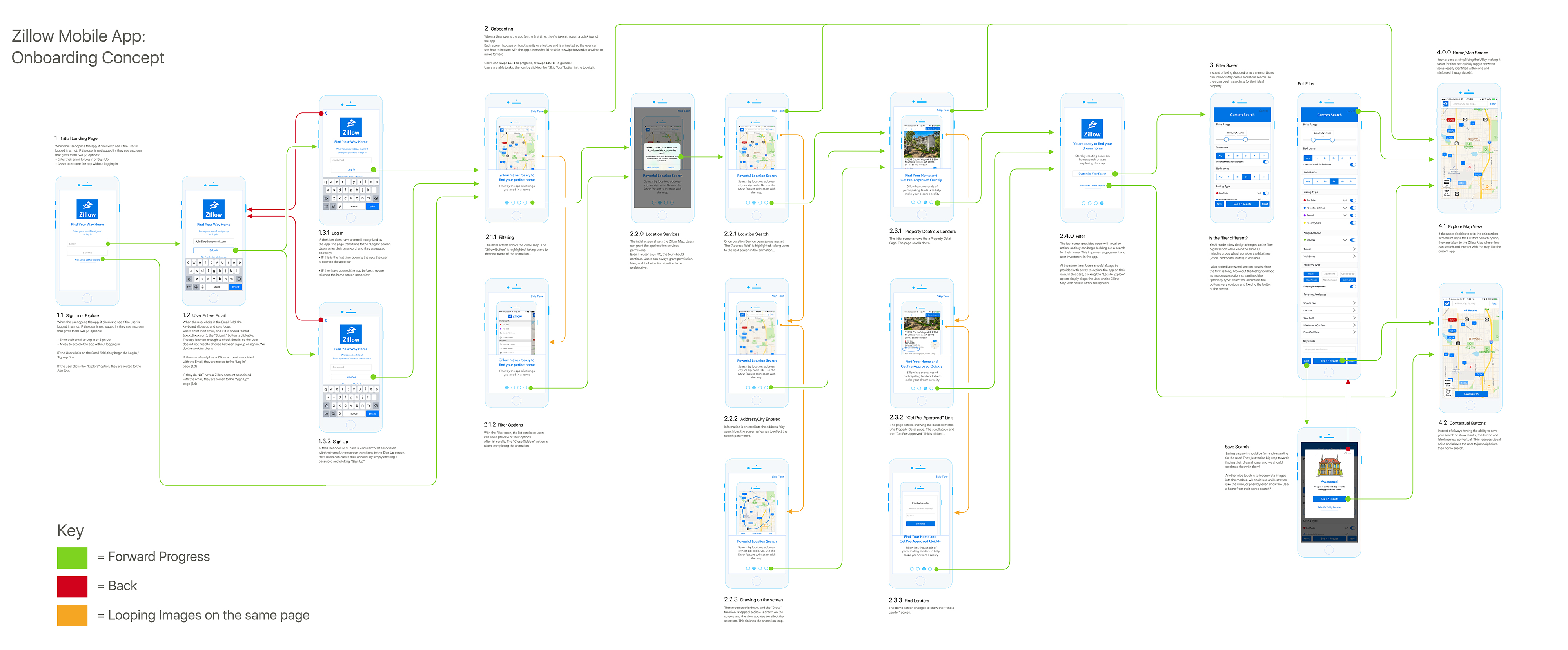
At the time I took on this project, I had been using the Zillow mobile app for about 3 years. As a platform, Zillow is great: It's quick, the listings are almost always accurate, and it incorporates financing, agents, and additional information like taxes and the neighborhood ratings.

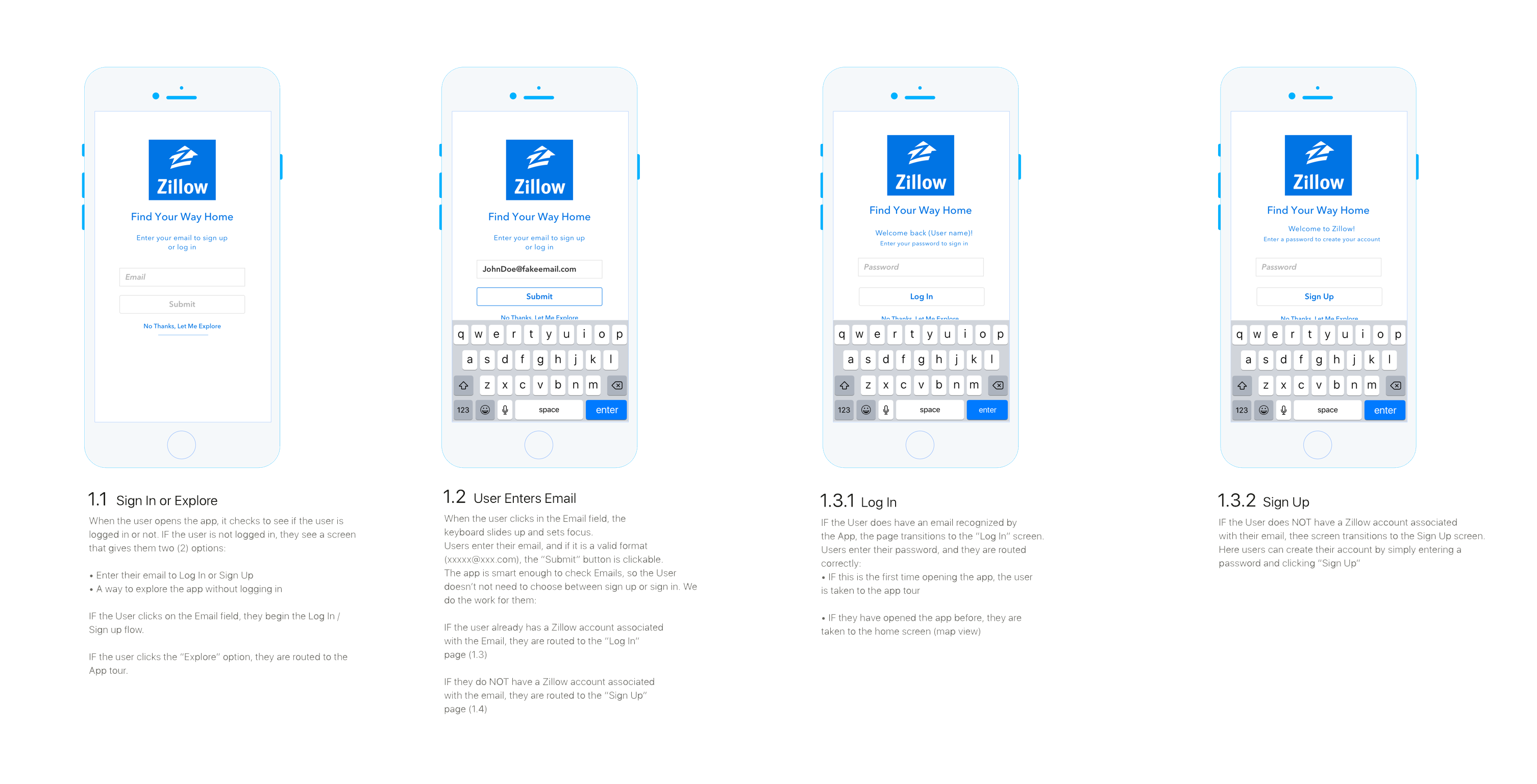
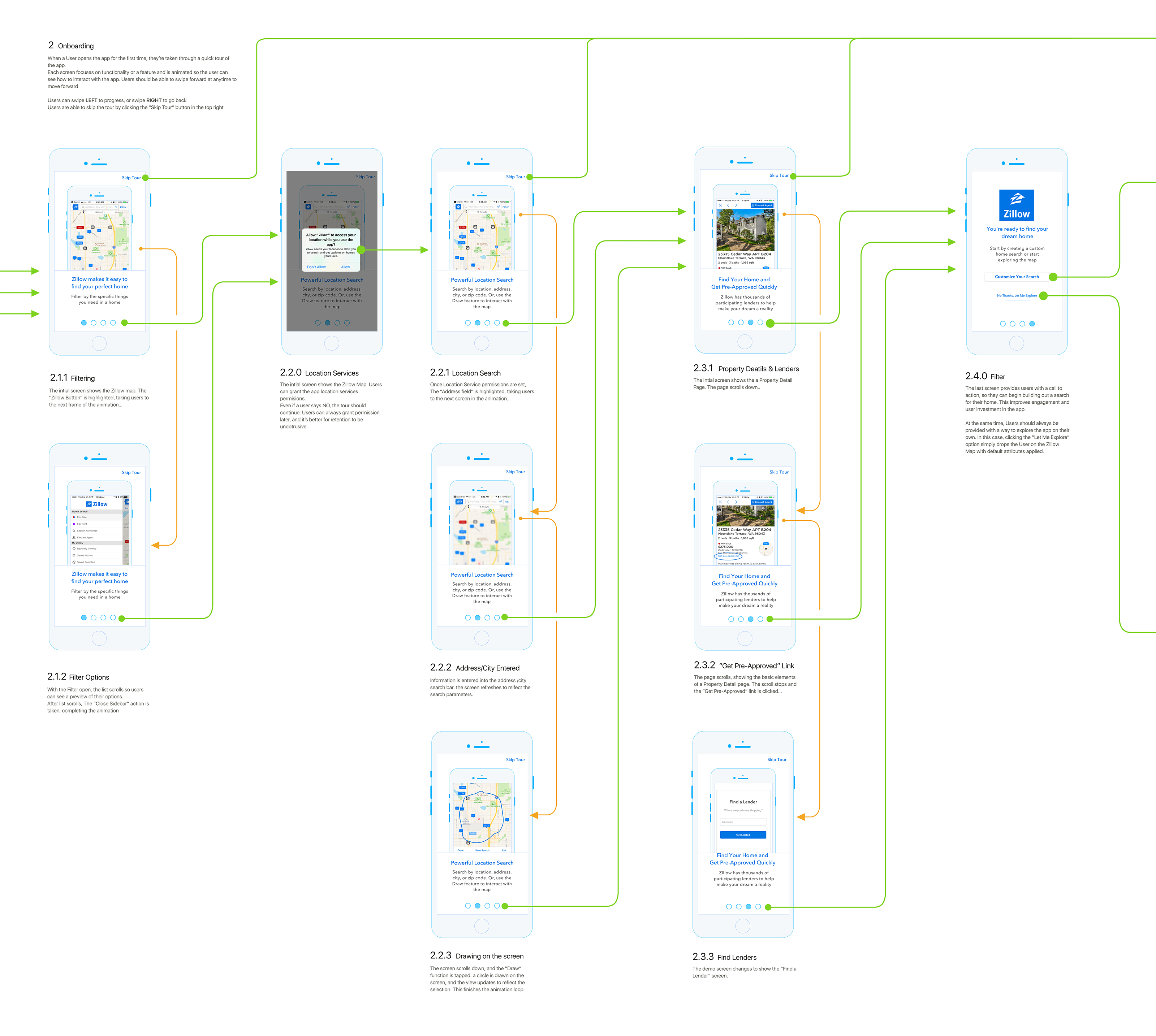
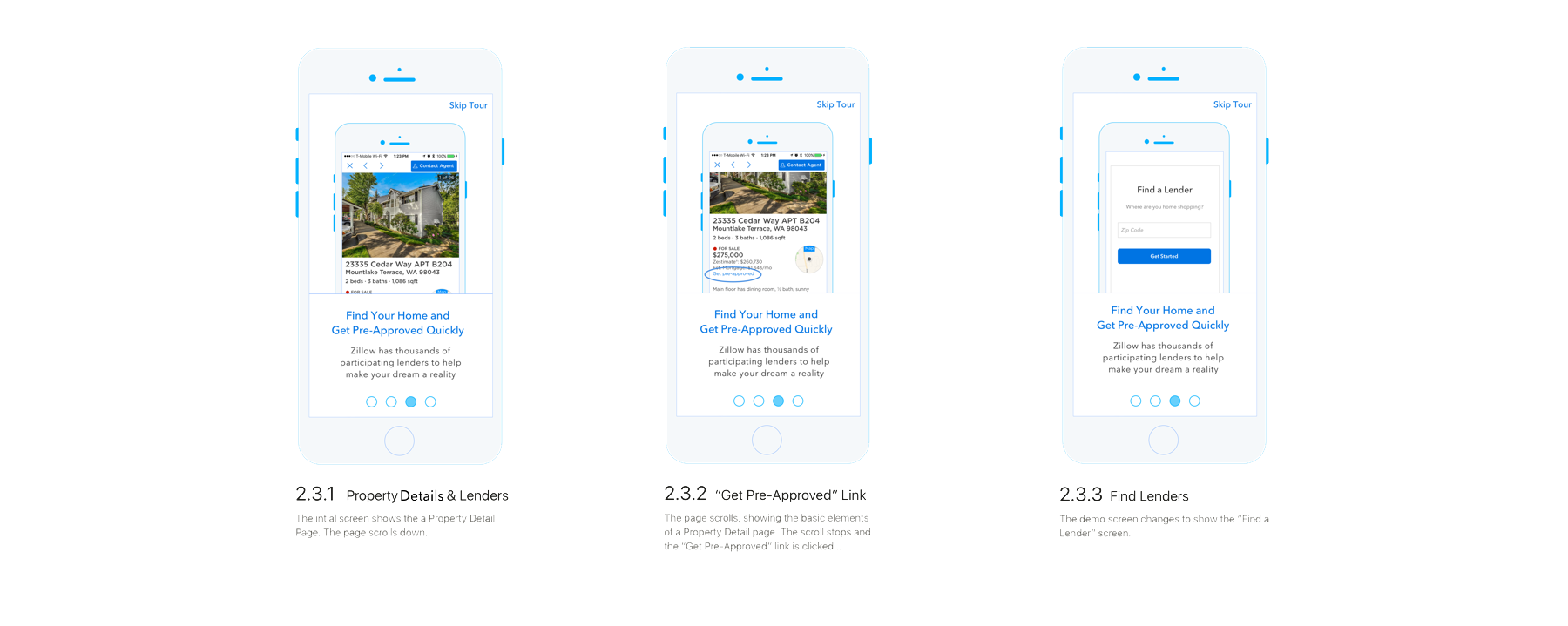
That said, It isn’t the most intuitive of apps, especially for new users browsing homes. Many of the features are difficult to find and the lack of onboarding hinders the usability. I spent months not knowing that key features existed in the mobile version becasue the focus of the UX is tuned for the quick discovery of homes, bu then lacks the depth to do anything with them. 
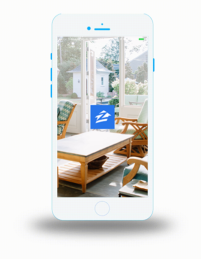
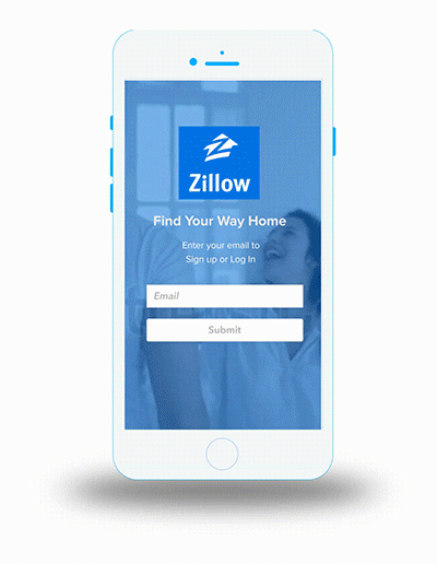
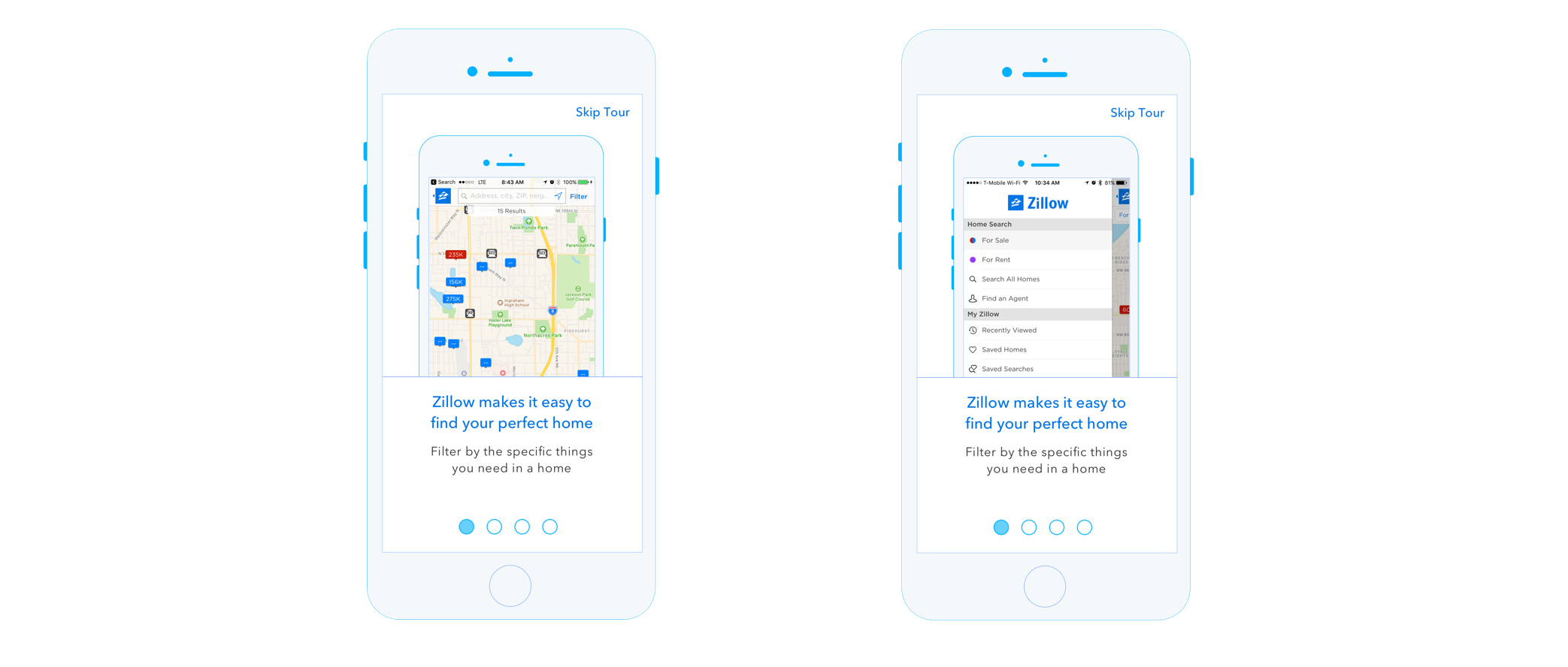
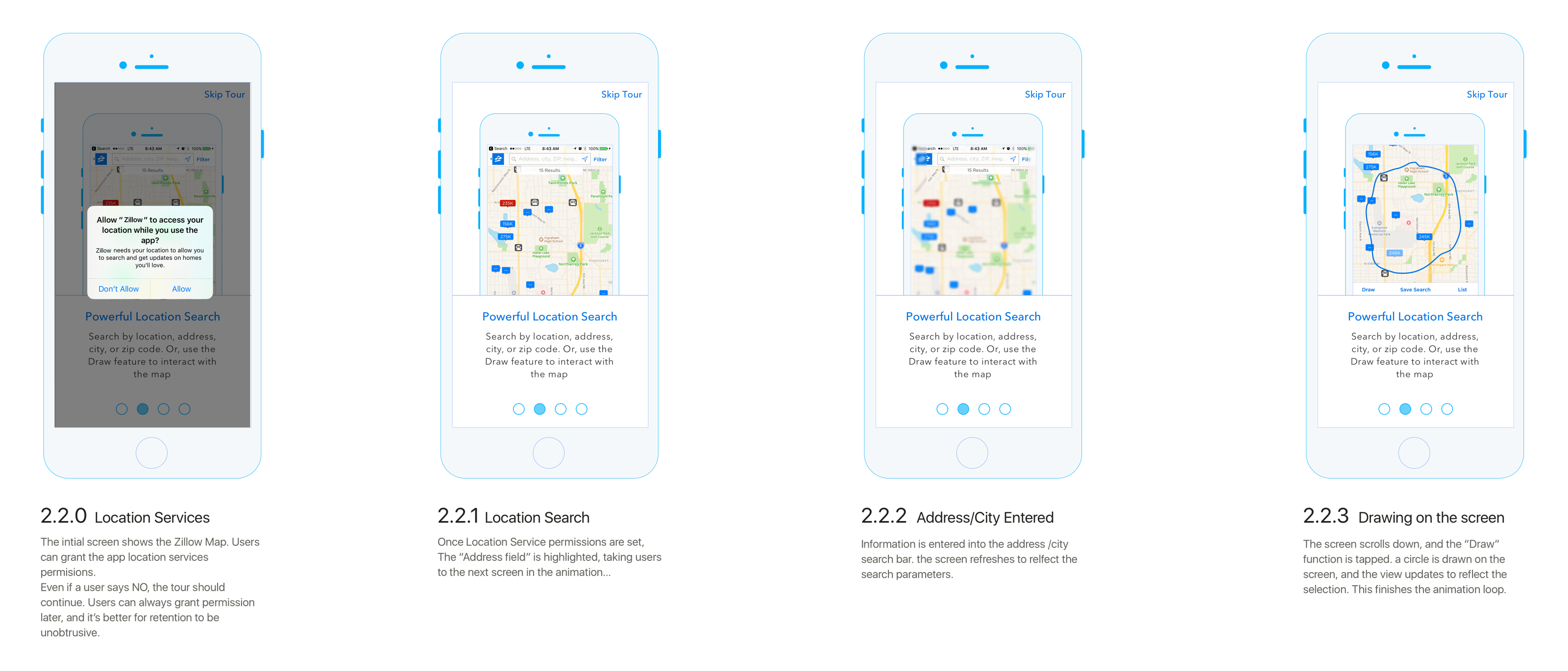
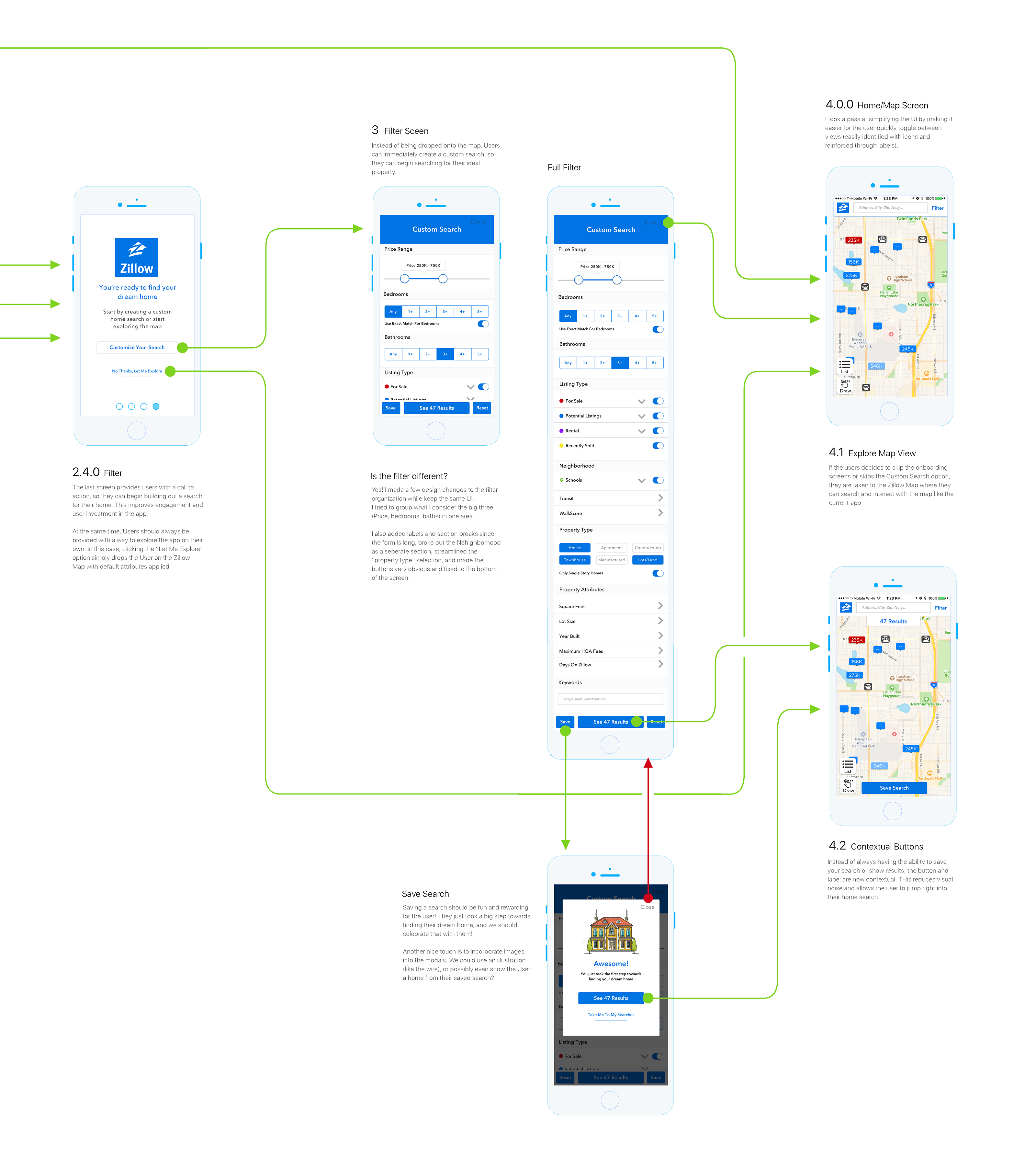
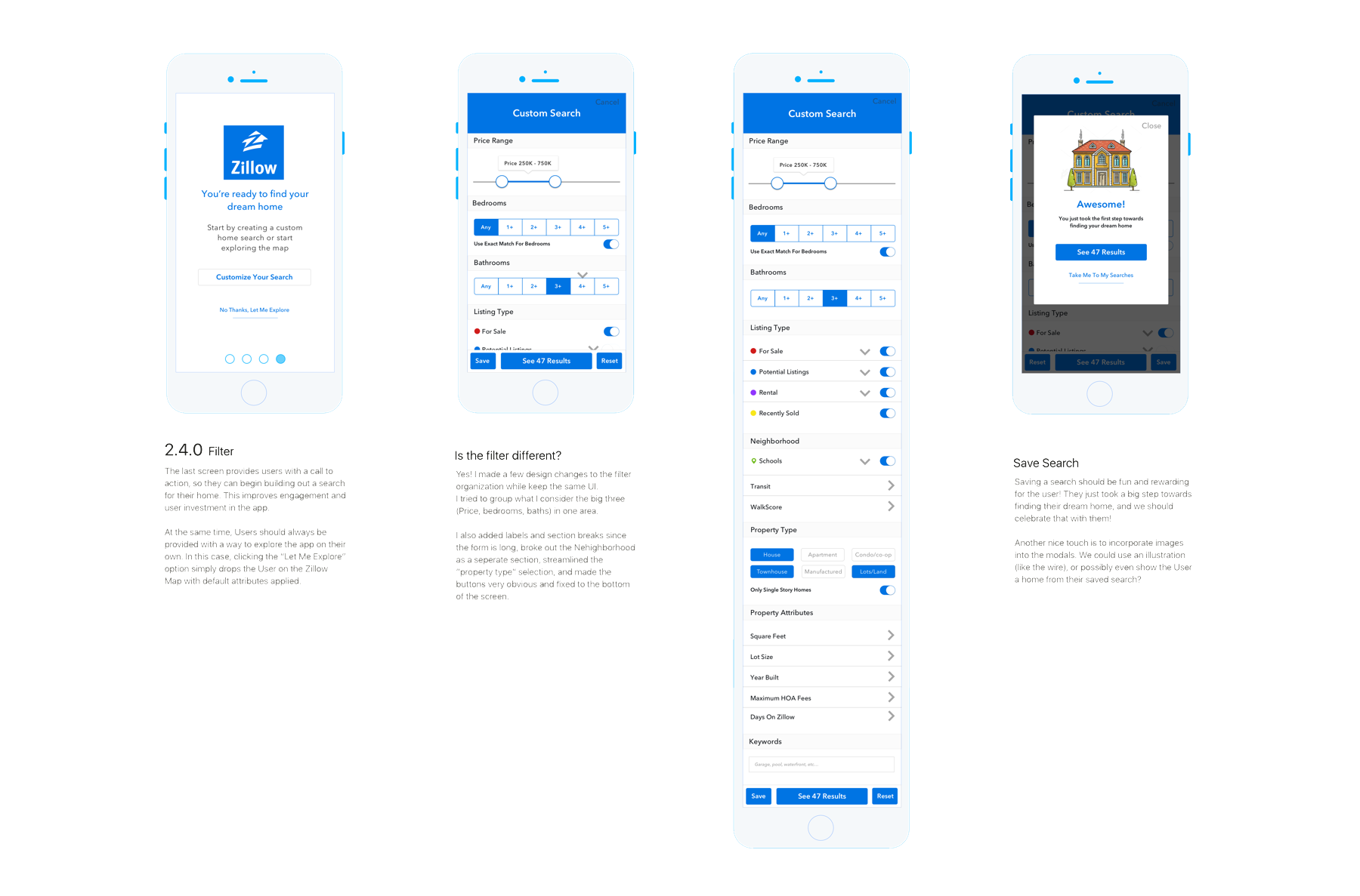
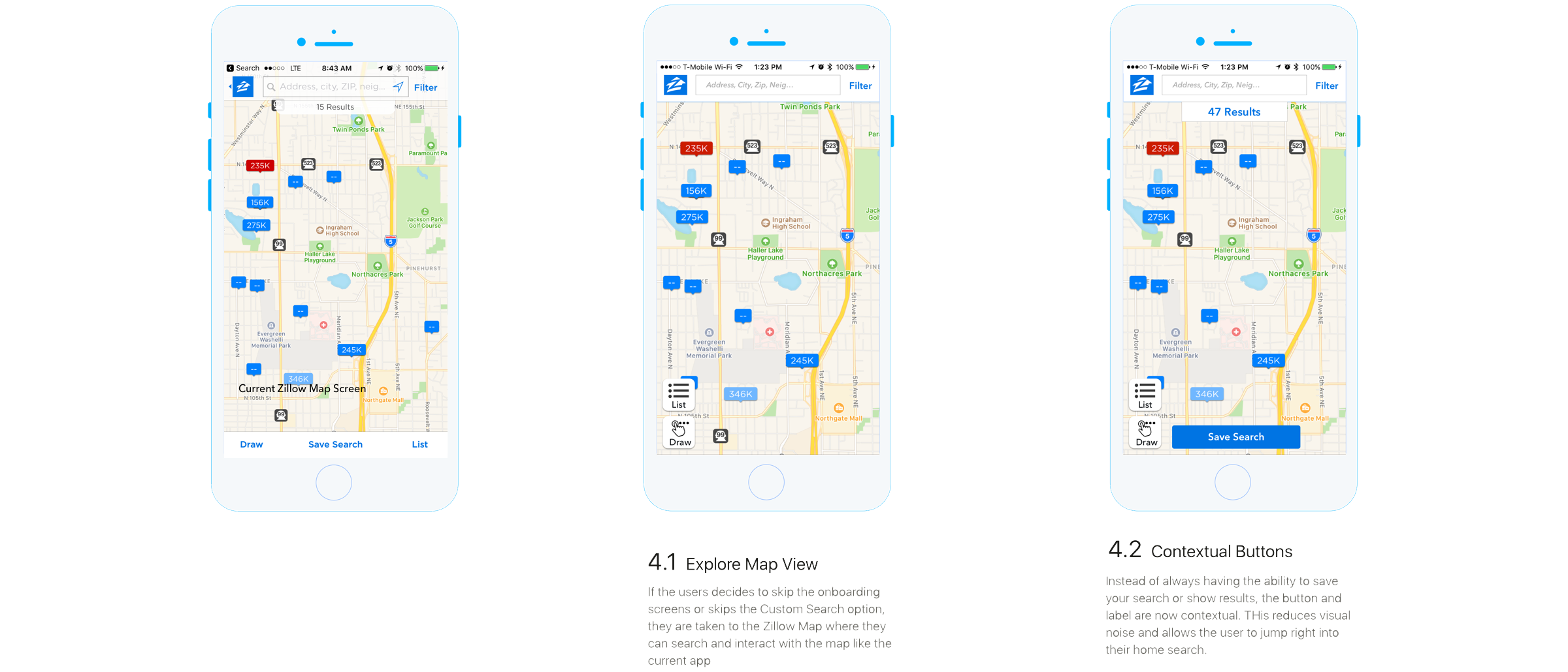
It also always seemed like a bit of a missed opportunity to not give users a warm and instructive welcome to the Zillow mobile app,
So I figured I would take a crack at designing an onboarding concept as a case study. Just to note - I did apply at Redfin in the spring of 2017, and figured this might be an interesting showcase piece. And interviewed at Zillow the following year. It may be synergy, but Zillow did eventuall end up incorporating a few of the concepts I proposed here as well... HMMM... 🤔

The Problem:


New users are not provided with a contextual or structured introduction to the features and flows in the mobile app.
This leads to users not leveraging powerful features and not creating accounts.


Goal: Improve the initial launch experience


Goal: Give users the ability jump right into a custom search for their perfect home


Goal: Demonstrate the features the Zillow app offers


Goal: Motivate Users to create accounts

Goal: Improve the initial Launch experience


When a User launches the current Zillow app, they're greeted by a simple splash screen. It's a little sparse, and doesn't provide any feedback about what the app is doing (no loading spinner, for example) and feels a bit generic with the stock photos. Buying a house is a big deal, and finding the right house is a lot of work. The app should be warm and welcoming, and give users a sense of hope that they too can find their dream home. Updating the splash screen to show the potential the product can provide is a step in the right direction.


Current Splashscreen on iOS
Updated Splashscreen on iOS


  • Added the full branding - Zillow logo and Name to reassure users they are using the official app
  • Added a tagline - Reinforcing to the user that the app is there to make home buying a reality
  • Show users the potential of the app - Instead of a static image, added a background video showing people enjoying their new homes. Push the emotional connection people have with the experience.
  • not shown in these wires, but in the designs below: gives users the ability to skip Sign Up / Log In and simply explore the maps

Signup & Login


The existing launch experience transitions the user from the splash screen directly to the map, with the menu active and no directive to Log In or Sign Up. The overall experience is disorienting for the user, and there is no guidance (outside of labels) that instructs users on how to use the different Zillow tools. 

An improved experience is to provide users with a Log In or Sign Up call to action. Users should also be able to skip directly to the map and explore, if they so choose.


  • 1.1: Add a screen with an email field and a button that lets a user skip the tour. Some users prefer to explore before they sign up
  • 1.2: Instead of separate log in / sign up screens, make the page smart
  • 1.3.1: IF a user has a Zillow account, then the app reacts to the email and welcomes the user and asks for their password. On submit, users are taken to the Zillow Map Screen
  • 1.3.2: IF they do NOT have an account, the app prompts them to create a new account by entering a password. On submit, users are routed to the onboarding flow

Onboarding Tour & Introduction


When a User logs in for the first time, they are taken to a new feature: the Onboarding Tour. The Onboarding Tour is designed to reduce confusion and improve the overall app experience by demonstrating the previous obtuse gestures and features.


  • Permissions should be integrated into this step. If possible, use the users location on the map during the tour
  • There should be no more than 4 screens/steps - Users can only retain so much information. This should be informative, but high level enough to not be boring or tedious
  • Swiping left takes the user forwards, right takes them back
  • Each step should be active - video, animation, etc. The feature should be shown in action, not just a simple static screen (Orange lines indicate the video screens in the flow diagram)
  • There should ALWAYS be an option to skip so users aren’t trapped

Screen 01: Navigation


The first onboarding tour screen focuses on basic navigation and the layout of the application. The video then loops through three different screens, introducing the Zillow Map and sidebar navigation:

Screen 02: Search & Map Introduction


The second tour screen focuses on how the user can interact with the map. The first screen also has a Locations Permissions overlay. On confirm or deny, the video then loops through three different screens. The first screen asks the user for permissions to use navigation services, while the next three cover how the property search functions. Search covers both search via the search bar as well as how drawing on the map to searc ha specific area works.

Screen 03: Finding a Property


The third screen focuses on viewing an individual property and how a user can begin the financing process. The screens show how to select a property and displays details. The finance options are also highlighted.

Screen 04: Viewing a Property


The third screen focuses on viewing an individual property and how a user can begin the financing process. The screens focus how a user opens and views a property and also elivates financing options. A large percentage of Zillow's profit comes from finance referals, so I highlighted it.

Custom Search


Home buyers tend to have specific requirements when searching for a home. This can including: bed/bath count, price, location, and whole host of smaller details. The current Zillow app doesn’t guide new users towards the custom search, and I believe that there is an opportunity to help personalize and streamline the Zillow mobile experience as the final onboarding step.


  • Moved the big 3 (price, beds, baths) to the top of the form, with Listing Type now located directly below
  • Added labels to section groups to make it clear what the section includes
  • The redundant “# results” has been combined into a button at the bottom of the screen.
  • The bottom bar is fixed, allowing users to always see the number of results their search is returning in real time
  • The current form uses 3 different selection methods. For single selection options, I made them toggles (property type) and visible on the main form.
  • The default location should be 50 miles from the user's current location. The location is pre-populated, and gives users the ability to set a location and a “bubble” to search within.
  • NOT VISIBLE: I created an alternative version that included a location search. I still think this would be a valuable additional
  • Users should be prompted to view the results of their search or save the search. If the user decides they want to save the search, they are rewarded with the “Congrats” card

Updating the Zillow Property Map


The Zillow map should remain the the home screen and hub of the app. To improve engagement and usability, I made a couple revisions to how the map reacts to filtered content as well as some UI updates.
 One odd experience with the current app is that actions (like saving your search) that should be contextual are available in states where actions have no results. It’s confusing to the user to hit “save search” when they haven’t searched for anything, and have the account log in / sign up page appear.


Another update was to remove the bottom tab bar from the map screen, which has the added effect of letting the user focus on the content (properties on a map) instead of feeling constrained by needless UI. I took the links in the bar and made them visually unique by adding icons as well as make them easier to hit by making them buttons instead of labels. The Save button becomes contextual.

Conclusion


Overall, I feel that my designs fill a hole that’s lacking in the current Zillow Mobile app: a simple way of introducing users to the app through onboarding and guide them towards account creation and custom searching.
 Thank you for taking the time to check it out!

See More Projects

Zillow Onboarding Concept
📱 iOS
đź’ˇ User Experience
🧠 Product Design
Westward.io
Radio... on the internet!
đź’» Web
✏ Visual Design
🧠 Product Design
Stations
Radio... on the internet!
📱 iOS
đź’ˇ User Experience
Get Started

Get in Touch with Me