Stations is a native iOS app that let anyone stream local radio stations to their phone without the limitations imposed by radio apps.
Existing radio-focused apps like iHeart Radio, Sticher, etc. work on an proprietorship model with little overlap - You can only listen to the stations that the company owns or has licensing the rights to.
This creates large gaps in coverage: For a single local market, you might need to use 3-4 different apps to access all the content that is available with a OTA radio. An some content just wasn’t available at all - Examples of content gaps: Sports, NPR, AM content, etc
Streaming is also region locked. If you happen to be “out of market” stations could be blocked, even if the OTA signal could hit you. This even extended to content available on the radio but not on the radio apps. Seahawks for example
Another issue is that radio apps prioritized their own advertising over live content - station content could be over-ridden by injected ads at random times, and it takes away revenue from local stations. And then there’s the “pay to play” model…
I ran the idea by my development partner Will and he agreed it would be an interesting project
Video Demo
Before we get into the details, here's a quick video demo of the final concept, built in Principle.

Is It Worth Buiding Something?
1. Would This be Useful?
at the time, no app did something so simple well. I figured I couldn’t be the only one annoyed… so I started doing research! It turns our there were a lot of irritated people who just wanted to listen to their local radio without having to jump through a bunch of hoops. Which made me realize there was...
2. A Gap In The Market
I hypothesized there was a biz opportunity - The proprietor model left a gap in the market that also excluded local stations, and no one did this “all in one” thing
3. Test Out New iOS Tech
New iOS features gave us the ability to grab the raw HTML data streams and use all the media player features. We wanted to test out new technical features within swift’s media player, and generally see if we could disrupt/break the system. Will wanted to use this project as away to test out some new functionality.
MVP Goals
- Must be able to select from a list of Seattle radio stations and stream from their hardcoded URLs
- Simple UI, with normal media controls - play, pause, volume, etc
- Leverage Swift/iOS tech - airplay, etc.
- Fast, Free, and didn't block local stations content
Design Iterations
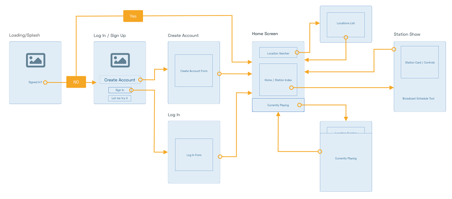
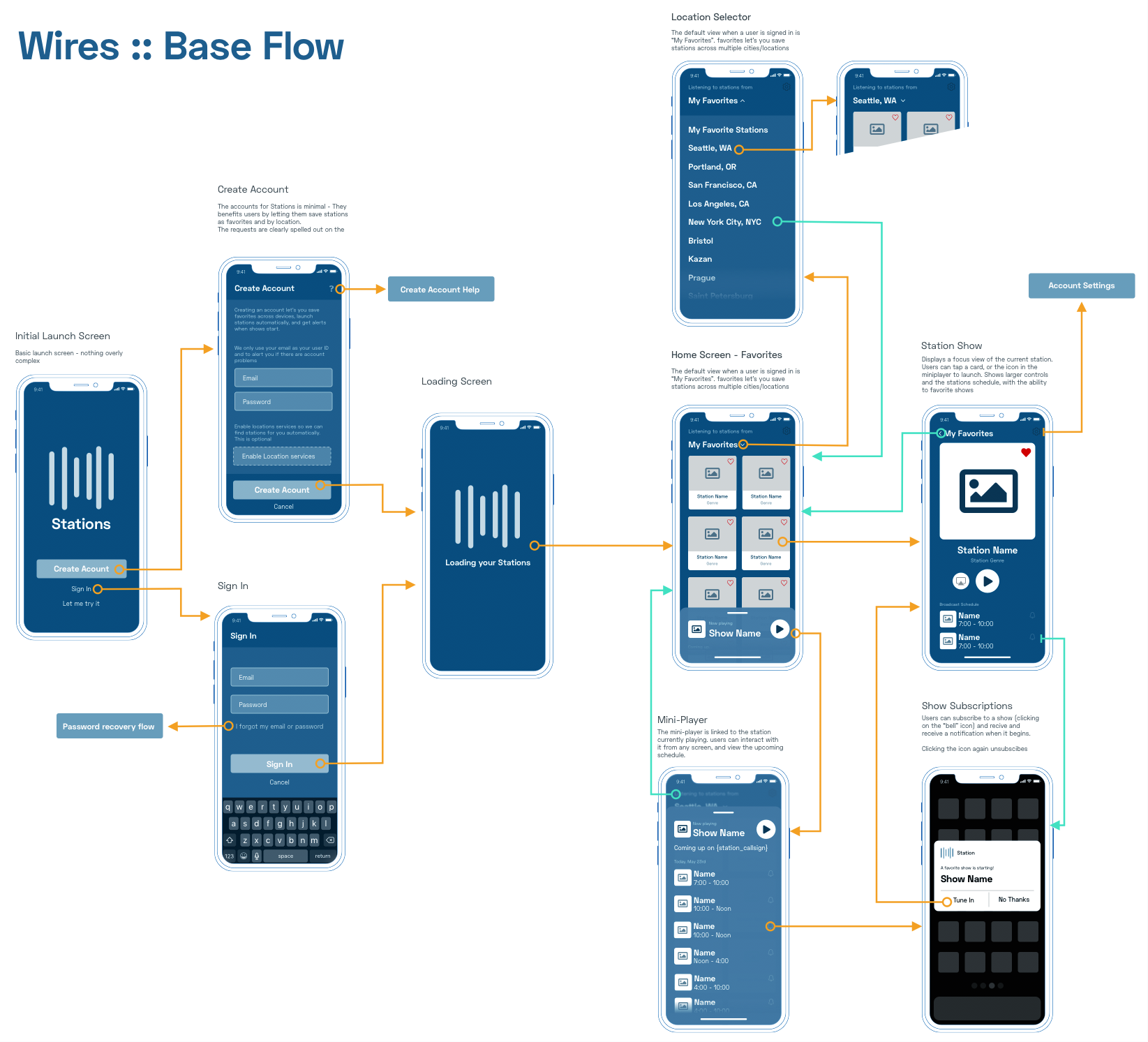
Flow
After validating if the idea is usful and hashing out reqs, I usually start by putting together a few flows to see if the feature sets make sense as a usable product. Stations is no different, so I put some together.
One thing we didn't want to do was make the app super complex. We both felt that we were already pushing it a bit by having different locations and an account sign up for the MVP. Setting up some simple flows helped dial in the right level of effort to make Stations a compelling package.
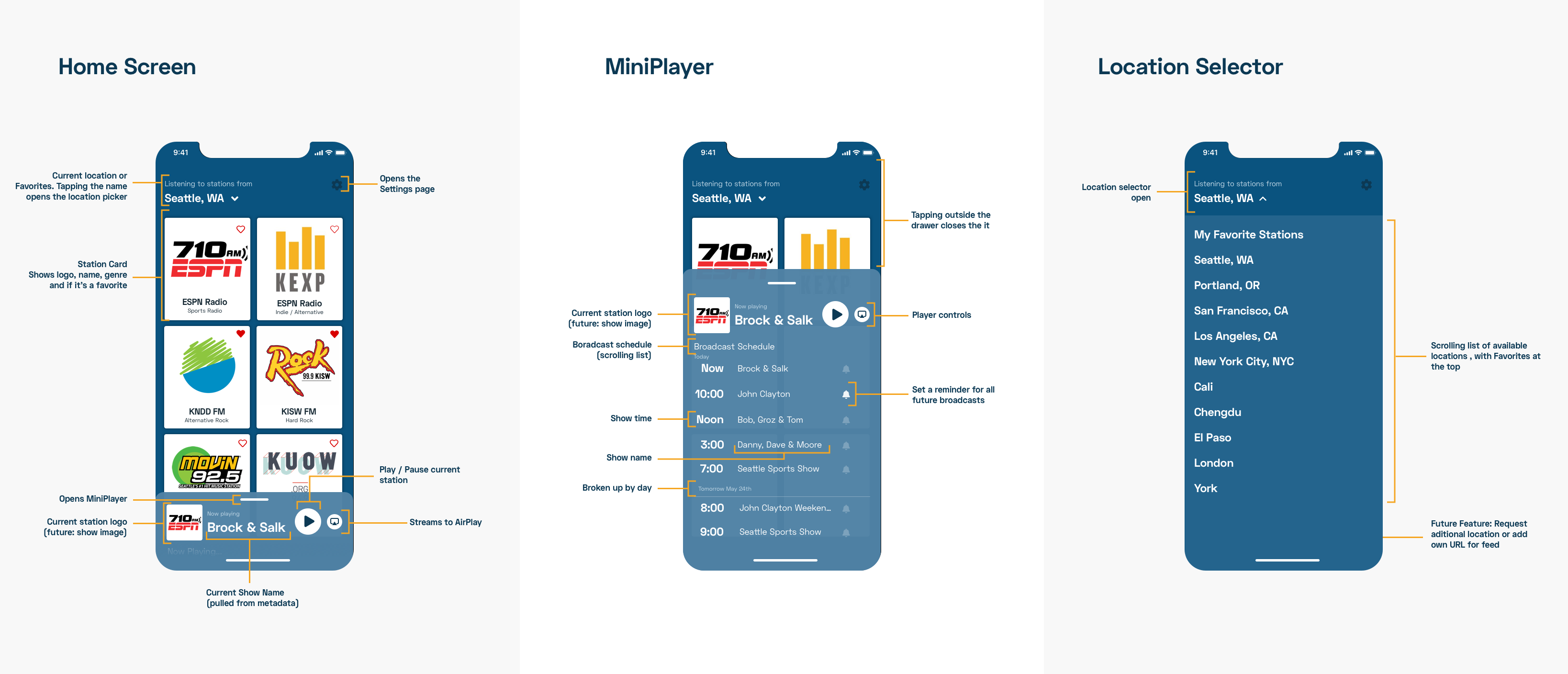
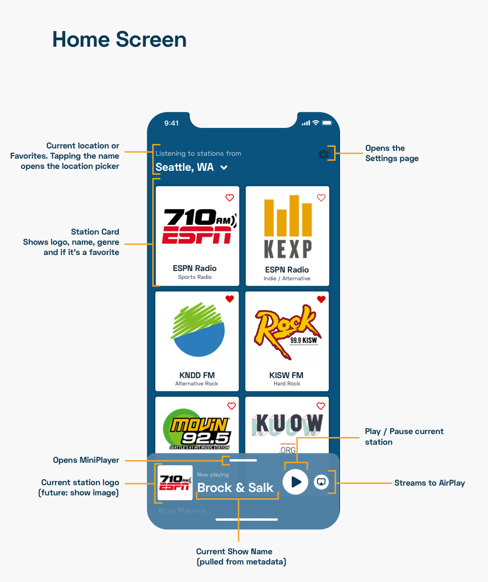
After determining the flow, we were able to design the MVP with a limited number of views, not counting things like splashscreens, preferences, etc (really, the views you would interact with on a daily basis). We settled on this limited scope for several reasons - First, complexity creates complications for both the users andthe team building the product. By focusing on the requirements, we were able to get limit the main views to two - The homescreen and station focus.
One thing we didn't want to do was make the app super complex. We both felt that we were already pushing it a bit by having different locations and an account sign up for the MVP. Setting up some simple flows helped dial in the right level of effort to make Stations a compelling package.
After determining the flow, we were able to design the MVP with a limited number of views, not counting things like splashscreens, preferences, etc (really, the views you would interact with on a daily basis). We settled on this limited scope for several reasons - First, complexity creates complications for both the users andthe team building the product. By focusing on the requirements, we were able to get limit the main views to two - The homescreen and station focus.
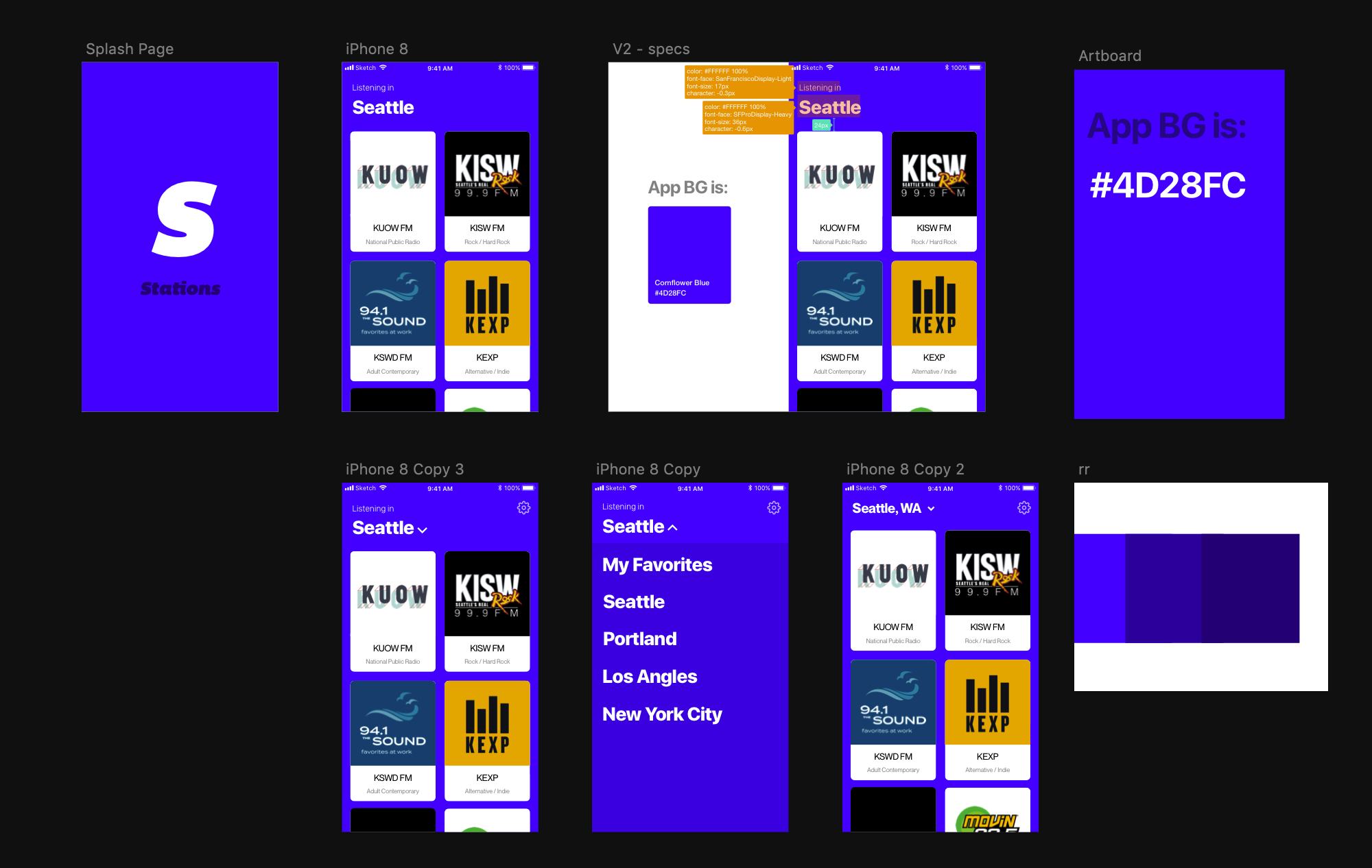
Version One
Once we agreed on a flow, I started putting together possible views. The first to get punted is what I'd call the "kitchen sink" version - Too many colors, weird gradients, etc. The original idea was that we wanted to use Seahawks colors and gradients, but it quickly became apparent that there were major issues including: General usabilty with contrast, the backgrounds competed with cards, and it was.... just ugly:
Version Two
The second pass was a little better, but still had some issues - the gradients and the blurs really slowed down the app, and the agressive station color background overlays interfeared with the station card logos and colors.
Version Three
The third version was a shot in a different direction - Make the design big, bold, fun. While this help fix some of the major performance and development issues it still didn't solve the UI/design issues. Again, we ran into contrast issues and color competition. I find these types of exercises helpful to hash out the "what if's" and get stuff wrong. I firmly beleive that with design, it's wrong 90% of the time until it's right.
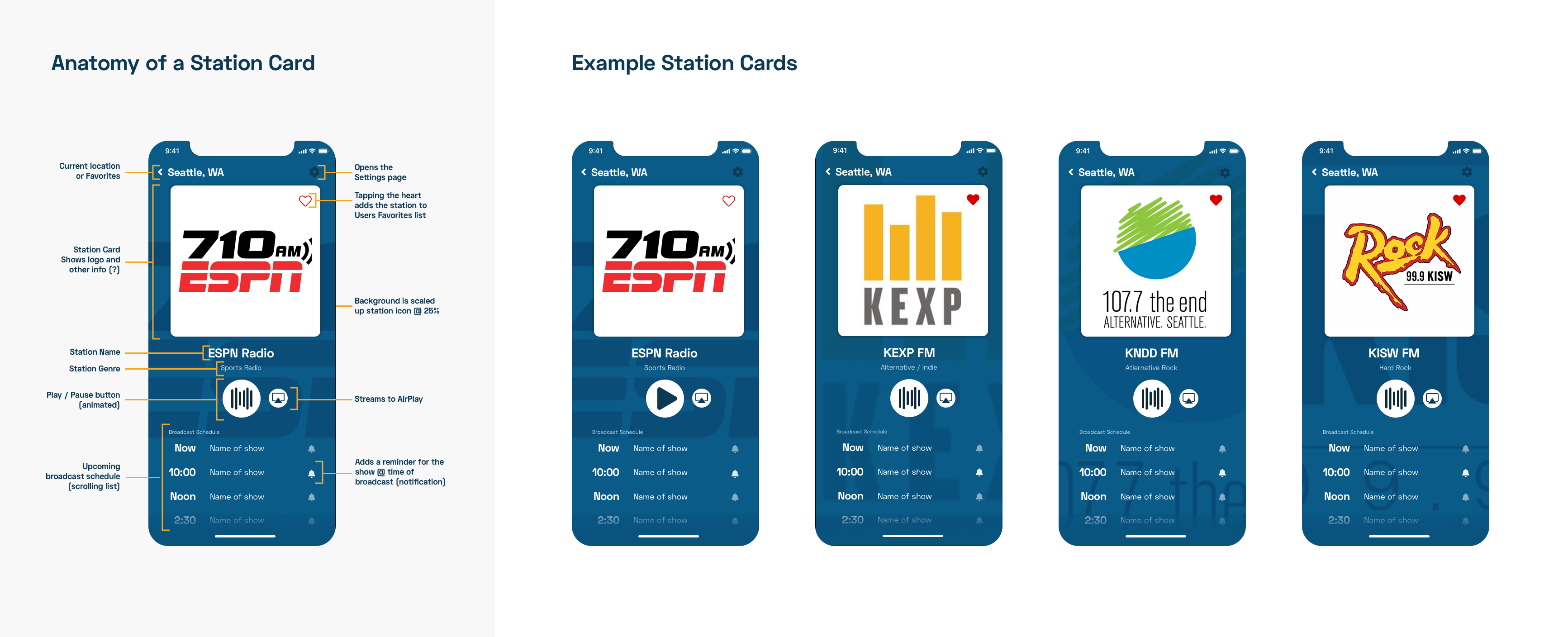
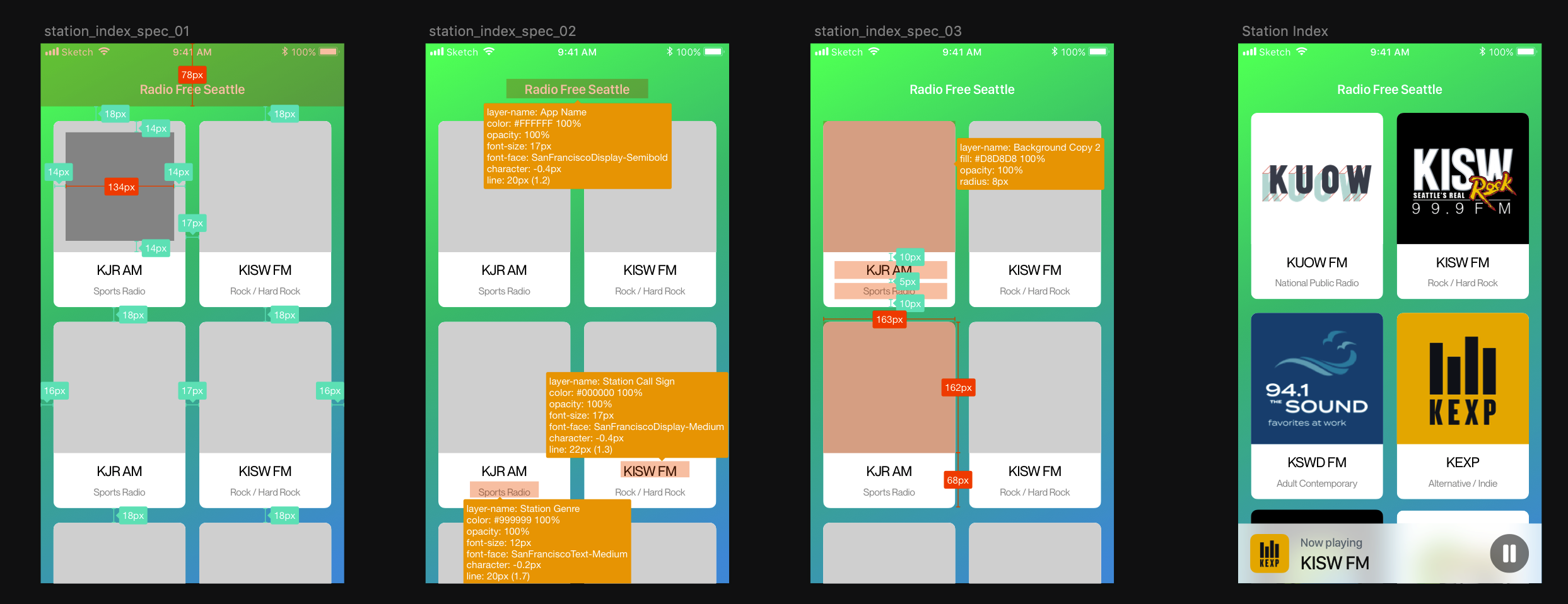
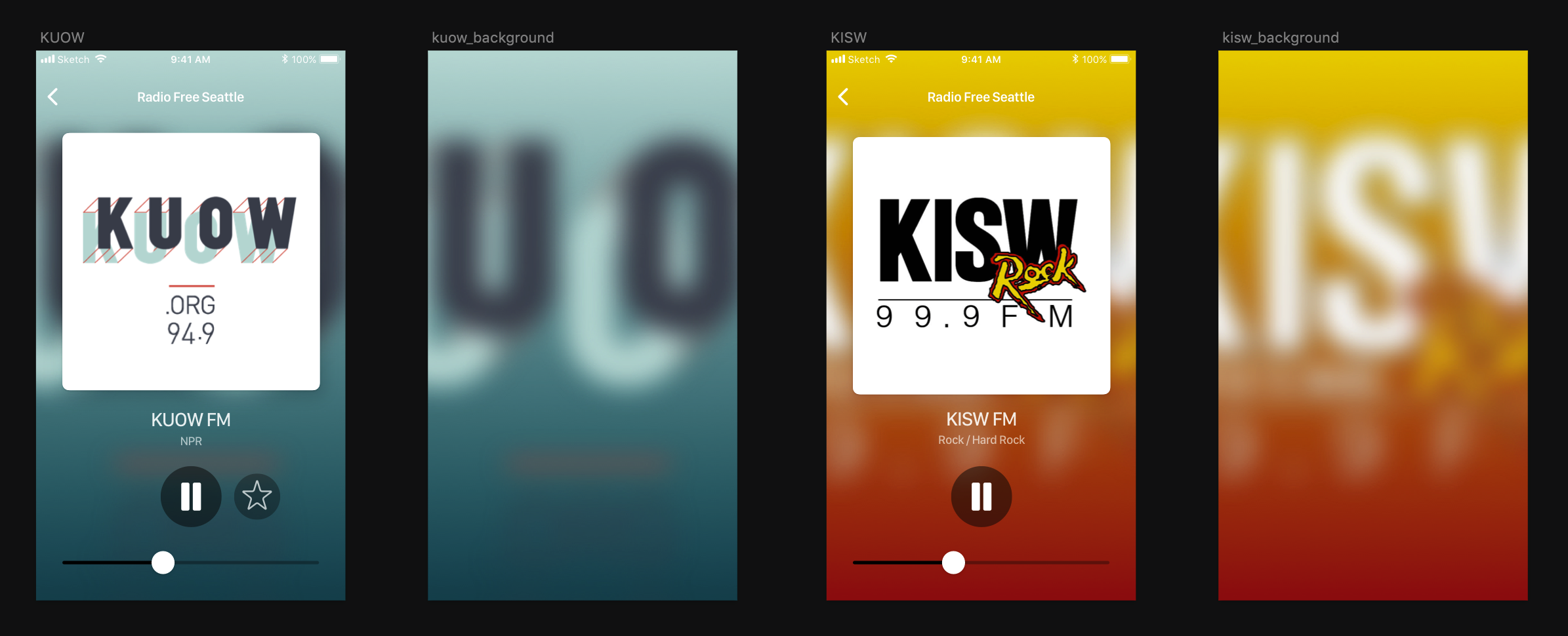
Final Designs
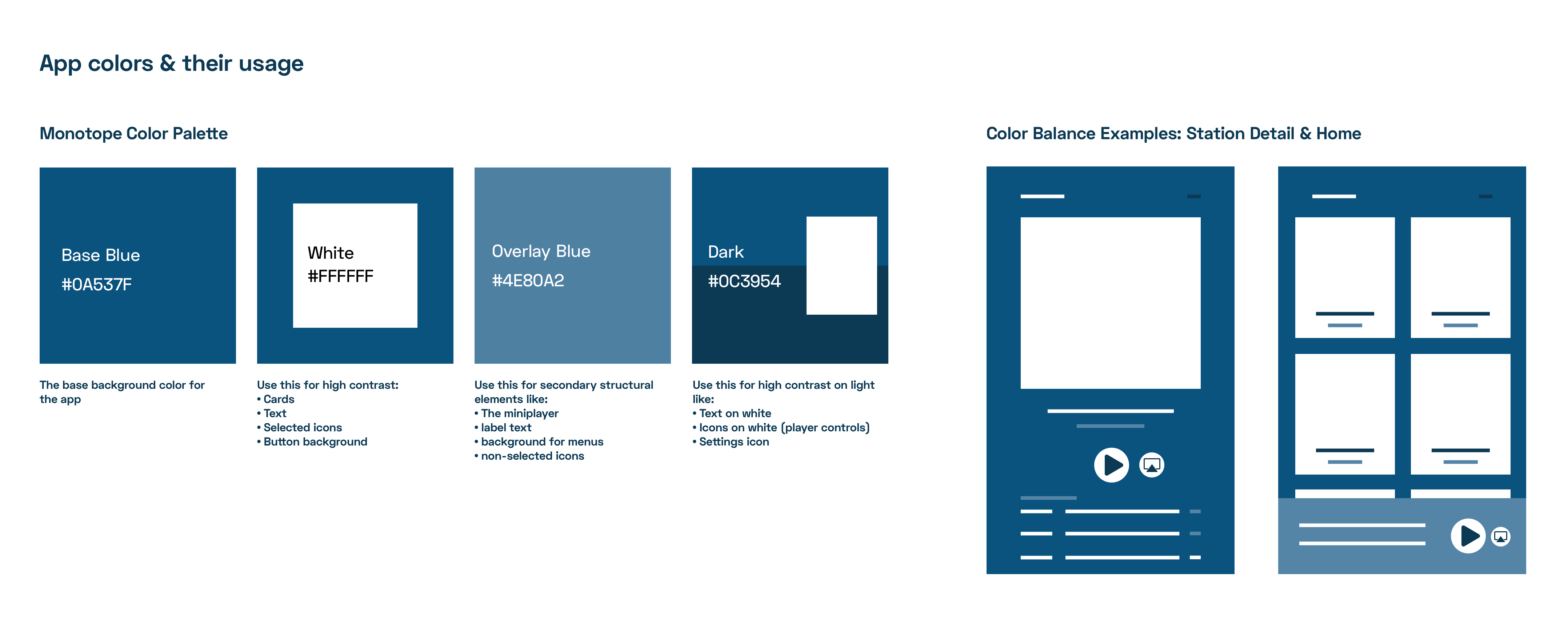
Style Guide & UI Updates
Since the flow and functinality had been simplified, i focused on putting togther a clean UI that would be clean and stay out of the way while still looking nice.
See More Projects

Thanks for your message!
Please, fill in required fields.
An error occurred while sending data :(