Revitalizing The Public Site

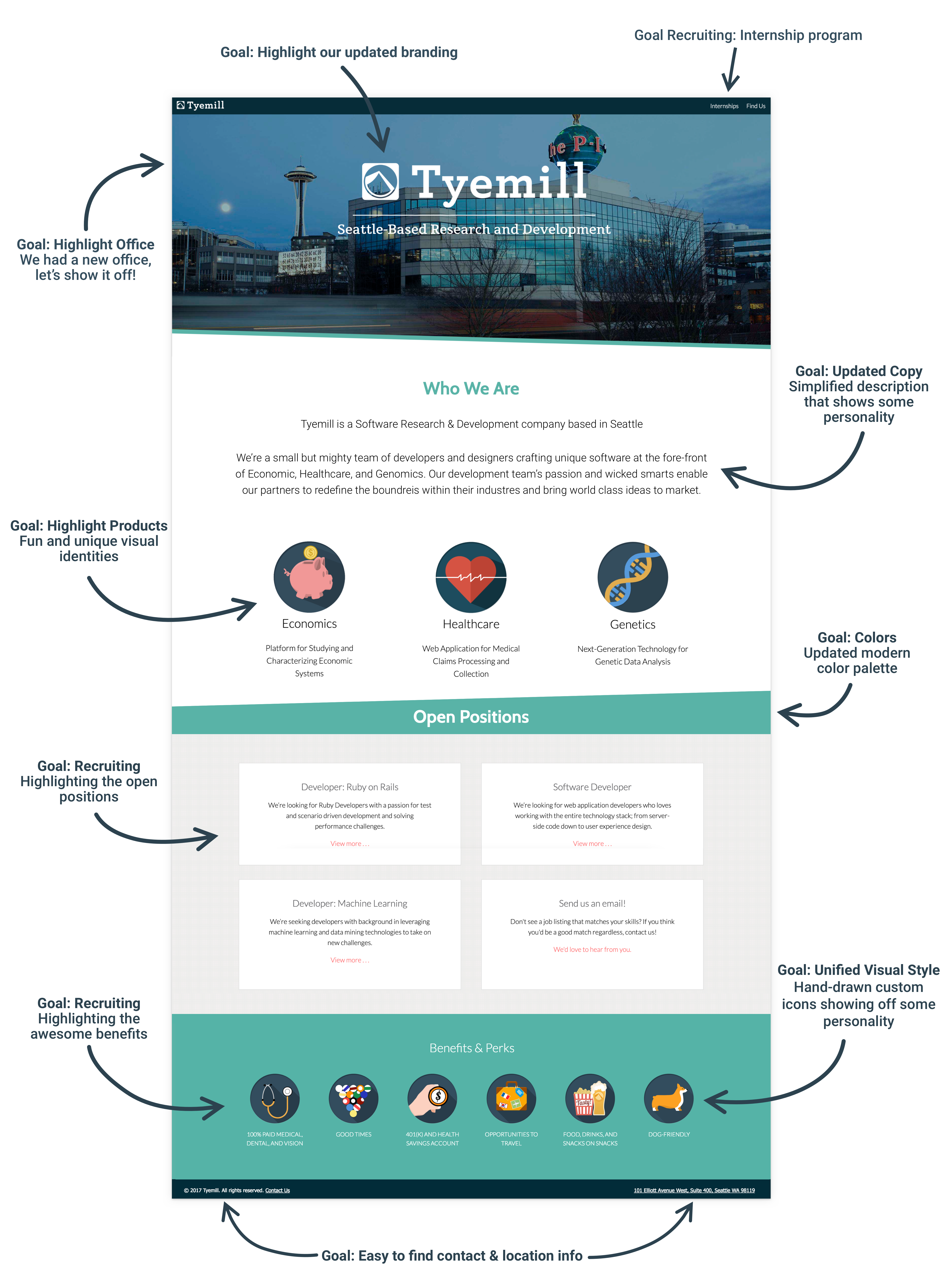
During my tenure at Tyemill, we tried several times to update our public facing site. While the original design was functional, it intentionally lacked information and was generally wordy and vague. At the time, this was viewed as an asset - the types of work Tyemill did was for a select set of partners, so having a site that flew under the radar was ok.

The original Site


The final push for change came when the company went through a major transition - we opened a new larger office and looked to expand our team. I lead the team as well as art direction and creation of all art assets. We organized the redesign around a set of key goals:

Key Goals


1. Focus on Recruiting


As the scope of our projects ramped up, we found that we needed to hire quite a few developers and designers and the old site didn't cut it. The old site buried job listing deep in the About section. In addition, we decided to launch an intern program so the entire process needed to be simplified.
The update moved jobs front and center on the landing page and listed internships in multiple places - as a job post as well as in the header. To keep listings up to date, we implemented a simple content management system that Tyemill admins could use to update posts without having to push code.


2. Update The Tech


The old site was not mobile friendly or responsive. It was also a combination of Ruby On Rails and html, making the whole thing very tough to work on. We rebuilt the site in Angular and setup a front end framework that gave us mobile compatabilty and responsive pages.


3. Show our Personality


The goal of the original site was to be a bit mysterious. As Tyemill the company evolved, the original site didn't capture the spirit of the company anymore. We opened an amazing office and started particpating in more community events, so we needed a site that not only highlighted our personality as an organization but gave prospective candidates a view into company culture and benefits. This lead to...


4. Style Updates


Vibrant colors, smooth angles, clean fonts, and shortened copywriting replaced the heavy green, long text, and hard edged icons of the original designs. This included updates to our product icons as well as employee perks, all custom draw by myself.

The Updated Design


By focusing on our key goals, we where able to put together a site that not only capured the personality and culture of Tyemill, but improved the information architecture.

See More Projects

Zillow Onboarding Concept
📱 iOS
💡 User Experience
🧠 Product Design
Westward.io
Radio... on the internet!
💻 Web
✏ Visual Design
🧠 Product Design
Stations
Radio... on the internet!
📱 iOS
💡 User Experience
Get Started

Get in Touch with Me